RSS
 

Games of my life – Part III

12 Oct

Tadam! The return of what was supposed to be a regular feature on this blog…

Today, I’d like to delve into the Sierra games. This is not supposed to be a complete list of all Sierra games (not by a long shot!), but more of an overview of games that really influenced me.

Although Sierra has many more games, it’s mainly known for its graphical adventures. Founded in 1979 by Ken and Roberta Williams and was (arguably) the first game development company to mix the common and popular (at the time) text adventures with some “high-definition” graphics.

This post is about the graphical adventures, there will be other Sierra games I discuss in other posts…

Most of these games feature controlling a character around the screen and interacting with the world by text commands.

I played most of them on the Commodore Amiga (so I had better graphics), but some of the later ones I played on the PC.

I’m going to talk about the games in terms of series, and in chronological order (not the order I played them).

King’s Quest

kingsQuest

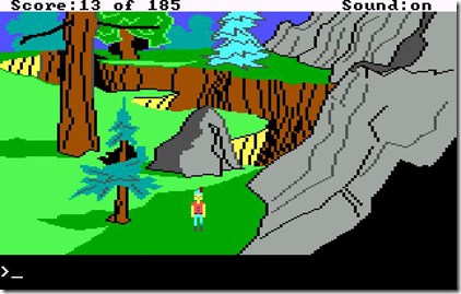
The “King’s Quest” series wasn’t the first Sierra game, but it was the first for the PC and is probably the most iconic of the lot, spanning 15 years of releases (1983 to 1998), with 8 games in the series (plus some spinoffs, a remake and the announced new episodic King’s Quest from Telltale Games).

The game followed the plights and tribulations of the royal family of Daventry and it was designed by Roberta Williams. The graphics now look extremely crude, but for the time they were amazing, specially compared to other adventure games.

This series has lots of mutation throughout its life, beyond improved graphics: first game with a female lead (King’s Quest IV: The Perils of Rosella), removing the text interface (King’s Quest V: Absence Makes the Heart Go Yonder), Disney like animation and singing (King’s Quest VII: The Princeless Bride), and full 3d (King’s Quest VIII: Mask of Eternity).

The games were good because of the use of lots of references from classic fantasy, like Little Red Riding Hood or Count Dracula. It made the world seem familiar, although its own identity was strong enough not to be overwhelmed and become stale because of that familiarity.

Space Quest

space_quest

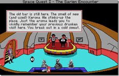
Created by Mark Crowe and Scott Murphy (alias known as “Two Guys from Andromeda”), the Space Quest series was my favorite one. Using the same game style as King’s Quest (in fact, most Sierra graphical adventures used the same engine, evolved from game to game), it featured the adventures of Roger Wilco, a perpetual loser. The game would parody lots of existing space franchises, like Star Wars or Star Trek.

The humor was the trademark of these adventures, and laugh I did… everytime I identified something from a known scify movie, I’d be terribly happy! Ah, simpler times…

The series started losing its charm when the Two Guys from Andromeda split up as a team (circa Space Quest V), but the four games they worked on together were pure magic (they were even characters in Space Quest III, which we rescue from the Pirates of Pestulon. We then proceed to bring them to Earth where Ken Williams hire them to make Space Quest!).

Leisure Suit Larry

leisure_suit_larry

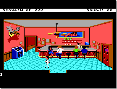
The raunchier of the group, this graphical adventure series created by Al Lowe is one the most well known of the Sierra catalogue.

It featured a character called Larry Laffer, a 40-year old man on his quest to get laid. The game seemed much more “sexual” in nature than it was in fact (and for today’s standards it is pretty mild).

Again, humor is the keyword here, the game making numerous references to 80’s iconic sex-symbols and seduction settings.

This was an extremely hard game for me to play as a kid (it wasn’t hard getting my hands on it, even though I wasn’t old enough to play it), because it required some knowledge about sex that I didn’t yet possess (although that didn’t stop me from finishing it and thinking: “what the hell?!”).

I’ve only followed this series until “Love for Sail”, but to be honest I felt it was terrible and gave up on the series.

Police Quest

Police%20Quest%20-%20In%20Pursuit%20of%20the%20Death%20Angel_1

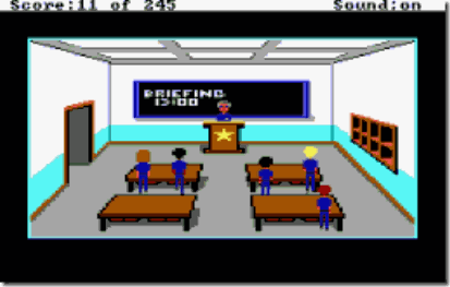
Police Quest is by far the most “serious” of all Sierra games… It was created by former policeman Jim Walls, which directed the series until Police Quest III. He left before the game was finished by reasons unknown, and the remaining games of the series (including the spinoff series “SWAT”) were taken over by former police Chief Daryl F. Gates.

I only followed this series until the 3rd one. The visuals on the 4th (photographed instead of drawn) put me off (at the time, even photographs looked terrible on a computer, so I was stuck in the uncanny valley).

The games had emphasis on following good police procedure (for example, you’d have to check the tires of the car before leaving the precinct or you’d have a flat tire and had to reload the game). The game featured driving around town in a top down map, police chases and police work collecting clues and such… For this, a map was provided to know the names of the streets and such, but I didn’t had access to original games at the time, so I had to learn them and create my own map: more fun! Smile

These games had a very good atmosphere, drawing you really into the police life and making you feel nervous about going into situations.

Quest for Glory

Quest%20for%20Glory%20I%20-%20So%20you%20want%20to%20be%20a%20Hero_8

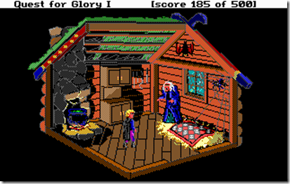
Initially called “Hero’s Quest”, this was my second favorite series from Sierra… Created by Corey and Lori Ann Cole, it featured RPG elements and allowed a player to import a save game from a previous game (actually importing his character, with the skills and wealth you previously had).

Each of the five games in the series borrowed heavily from a specific mythos, from Slavic to African tradition, to everything in between.

The role playing element influenced the game very much, and separated it from the other fantasy series in the Sierra catalogue (“King’s Quest”). You could choose to be a warrior, magic-user or thief, and some puzzles had different solutions depending on this (and how high your skill levels were). This sometimes became a bit frustrating, since some puzzles would require you to do tedious tasks in order to level up a particular skill, but the feeling of epicness was huge!

The stories tied into a big arc, to be resolved on “Quest for Glory V: Dragon Fire”. Unfortunately, due to financial issues, the game was a bit rushed and it feels like an anti-climax…

Laura Bow

Laura%20Bow%201%20-%20The%20Colonels%20Bequest_1

The two Laura Bow games, “The Colonel’s Bequest” and “The Dagger of Amon Ra” were more “under-the-radar” titles than the usual Sierra fare.

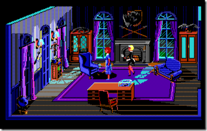
This was probably due to the key point in “The Colonel’s Bequest”: events took place in semi-realtime. This meant that revisiting locations was important, because the environment would change depending on the time (or other actions somewhere in the game).

The idea of “The Colonel’s Bequest” was to create a real “murder mystery”-type of game (like the first games Roberta Williams designed for the Apple II, like Mystery House), it was right on the nose on that. Finding the murderer was really rewarding, although it was extremely hard for the time.

The sequel, “The Dagger of Amon Ra” was much more straightforward and back to the origins, taking less risks in terms of game design. That can be explained by the fact that Roberta Williams wasn’t involved anymore. The story was much less ambitious as well, using more stereotypical settings and characters than usual in a Sierra game.

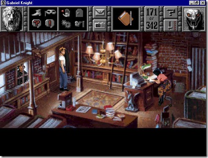
Gabriel Knight

gk2

Created by Jane Jensen, this series was a weird one for me… Although I loved the first one, I loathed the following, mostly because of the art approach (replacing hand drawn graphics by full motion video, with less than stellar interpretations).

The first game takes place in New Orleans and involves a mystery with voodoo contours. The games atmosphere was amazing (specially considering this is a 1993 release), and the writing is really good (a constant throughout the series, even with me not appreciating the sequels).


The Sierra graphical adventures might not have been the best games ever, but they are certainly some of the most influential… in a time where most game stories were “aliens are invading, shoot them!” or extremely boring text-based adventures, they opened a new door combining imagination and game, mixing them seamlessly to create an experience that I seldom felt so strongly about since. From the sheer scope of the games (from space operas to fantasy RPGs), to the risks taken in producing them (innovating just enough to keep ahead of the competition, but not so much as to lose that special something), Sierra has been successful in not only building great games, but in building a legacy…

Every time I create a story for a game, I can’t help but feel that I’m paying homage to the past where I spent so much of my time… For example, I can’t help but compare “Blitz and Massive” to “Space Quest”…

Sierra will always have a piece of my art due to these games and I was extremely sorry when they faded and disappeared (even if I didn’t think their last graphical adventures measured to the old ones)…
 
No Comments

Posted in Games


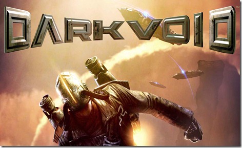
Dark Void

10 Oct

dark_void

Just finished playing “Dark Void”… When it came out, it wasn’t something I really needed to play, but I found it on the bargain bin and decided to give it a try…

Rant number one: DON’T PUT SPOILERS ABOUT THE STORY IN THE FLAVOUR TEXT ON THE LOADINGS!It’s just stupid and kind of ruins the game for people that actually enjoy being “surprised” by the story.

Anyway, having finished the game, I can’t help the feeling that the game was rushed, which is too bad. Given more time, the game could have actually been very good, instead of just average.

From a game mechanics standpoint, the game is the usual fare of 3rd person adventure games, but with some nifty things. It has a “vertical combat” mechanic that is actually fun and interesting, in which your characters is dangling on ledges and such and has to fight enemies. The other one is the main selling point of the game: the rocket-pack parts.

Most of it feels solid, although the level design borders on boring sometimes. For example, the hangar part reminds of the obnoxious “Library” level on Halo 1, being too long and the same from start to finish, without anything interesting happening (besides killing hordes of enemies, of course).

But where this game fails the most in the story-telling… they’ve created an interesting premise, with a lore-basis that might have been original, and then ruin it with basic storytelling (with basic storytelling mistakes)…

In the game, you play as a hot-shot pilot that has to ferry his once-lover to some place, for some reason (yep, it’s that detailed) and instead get sucked into the Bermuda Triangle that leads the player to another world… Not to spoil the game for anyone, stuff happens there… Smile

The basic plotline is paper thin, the cut-scenes are generic, converting what could be interesting characters into simplistic archetypes and hinting at a larger than life world outside, but never showing it, or letting it interfere with the game itself… Most of the game you spend your time going from place to place, doing things over a time span of supposed months, but nothing has actual bearing into your motivations… most of the time I didn’t know WHY I was doing things, although it was very clear WHAT I had to do.

And it’s a shame, really, because there are some visual details that are interesting (the Watcher’s “hair”, for example), but it gets lost into the usual “fight the minions of the real bad guys, which are actually robots because we don’t want to show blood”… and don’t get me started on the climatic finale, which the game has been gearing up since the start… it’s silly and inexplicable and introduces a plot hole the size of a small planet!

It feels like either the game was rushed, or without a solid direction from the narrative standpoint… the things it does badly (from generic characters with no charisma, to the use of the over-used Tesla as “science-guy”, the single black guy that speaks as if he’s just come from the middle of Africa, the pieces of “lore” that are dropped in the middle of the story, the list goes on forever) are basic ones that are covered in any narrative course!

And it’s too bad… the game disappoints because it has good concepts, we can see its potential and then it drops the ball almost continuously… 6/10

 
No Comments

Posted in Games


RIP Steve Jobs

07 Oct

20111005_stevejobs

As most people, I was kind of taken by surprise by the announcement of the demise of Steve Jobs…

We all knew of his disease, but still he felt in a certain way unbeatable, and as such, immortal…

I was never a big Apple fan, for several reasons, but without a question, Steve Jobs was an amazing visionary, a hell of a marketeer, and the face of one of the biggest computer revolutions of the last 10 years – the true mobile-related market wouldn’t exist without him.

He made mistakes, like so many other people that have a dream and try to make it a reality, but we will remember him by his successes more than his failures and it is with sadness that we see him go…

RIP Steve…

 
No Comments

Posted in General


Sub-entities

03 Oct

Some more work on my SurgeEd…

The next step on my editor is the decal system… Although Spellbook already supports decals, I want to make the system better for authoring and for resource management.

At the moment, a decal references a decal sheet, which is a structure that defines UV coordinates on multiple textures (for normal mapped decals, etc), but I want to collapse the decal sheet and the image bank into a single structure, since it’s easier to manage.

To do so, I’ve decided to build into the editor a “Image Bank Editor” component, which will enable me to place images in a series of layered “texture sheets”, and after some consideration, I’ve started building a system with support for sub-entities, that is, entities that can only be bound to a specific entity.

Easier said than done… I did some mistakes in the general construction of the base system which made this much harder, specially on the interaction of the Component Explorer (the tree-like view where you can see all the objects and select them, drag them around, etc) and the main component system.

The base system was pretty easy to get up and running, but creating the right hooks for the Component Explorer to work nicely with the overall structure, including the Undo and Clipboard systems proved a challenge…

Fortunately, I got it working, and the future expansion of the system will allow me to create very interesting things, like object properties that reference an entity in the scene.

Tomorrow I’m heading out to the Netherlands for some work (sadly, I have to have one of those to make a living), and hopefully that will enable me to make some blog posts for the future (so I don’t spend so much time “away” from you, my loyal readers!) Smile


Porting issues…

28 Sep

Since my artist is still out of commission (and probably will be for another month), I’ve been doing mainly technical things…

Since I was feeling lazy and didn’t want to add the tutorial code yet (since that’s GUI work, and I hate GUI work), I’ve decided to start porting “Cell.ection” (if I haven’t mentioned it yet, that’s the current name for the game, although we’re still arguing between “Cell.ection”, “Cell.Action”, “Cellection”, with different types of writing styles) to personal computers (Windows, Mac, Linux are the targets).

Decided to start with the easy one: Windows, and I partially succeeded…

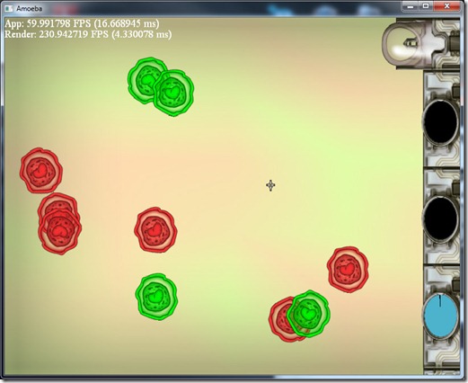
Amoeba_PC

Found several problems:

  • A small bug: I deleted an object from itself (“delete this”), but I set the animation of that object to false afterwards… curiously enough, this didn’t raise an exception, but it crashed (or more precisely, Visual Studio raised an exception because it detected memory that should have been free altered) because of memory corruption… This behavior didn’t happen on the mobile version because apparently Marmalade doesn’t use the same trick to track this kind of problems.
    On allocation (and on debug mode), VS initializes memory to zero, and when a de-allocation occurs, it sets that space to a familiar pattern (like all bytes set to 0xAE or something like that). When an allocation occurs, the system verifies that all the bytes are set to 0xAE, if not someone messed with that memory address after it was released and raises an exception. It’s a neat trick… In this case, messing with the memory like I was doing wasn’t a serious issue (hence no big issue in the mobile), since I deleted the object and set a boolean value to false, so I couldn’t corrupt any new objects in the process, but it could mean something serious. Ah, obviously enough, the heap is all initialized with that mask (or else the first allocation would raise an exception).
  • If you look at the screenshot above, the GUI is all compressed… That was a trick to get it to render at all… I didn’t remember, but the D3D API doesn’t allow for negative values on the viewport settings, and that was what I was using to simplify my multi-resolution, aspect-ratio agnostic system… So I’ll have to change the way this works (probably by shifting the viewport to be all positive, and offsetting the objects there to reach the same visual result).
  • The fonts look terrible, due to the larger screen size… they probably look terrible on the mobile as well, but it doesn’t show because the screens are smaller. Need to work something out on this, probably change my bitmap font generator so that it does some multisampling on the fonts, or maybe integrate OpenType to build the fonts in real time from TrueType fonts, adjusting to the resolution.
  • No cursor… In mobiles, we don’t need/want a cursor, but in a mouse based system, it’s kind of necessary… Not only that, but some feedback on the buttons when the mouse is over them is also a bit necessary… This implies having some “ifdef/endif” blocks in the code, which is kind of ugly… Of course I could do this data driven, but sounds a bit like overkill for something like this.
  • File directory structure… Marmalade assumes that all files in a certain “data” directory will be packed into the package for mobiles… Problem is that if I use the same paths on the mobile and PC version, I need to have some DLLs on that directory (FMod, for example), which sucks big time… Probably need to think a bit better on the directory structure, specially to see if I can sort out some kind of override system so that I can have different assets for different platforms (more resolution on the fonts, for example), while keeping the common part together…


This is one of the reasons why this project is so interesting from a learning perspective… Although the code part of it was ported without needing many changes, just create a new VS project and dump the files there, there are still lots of small issues associated with multi-platform deployments that must be addressed (and now is a good time, since I can still change the way SurgeED works to do a better job at this multi-platform asset management).

I’ve also been working on a second port, this time from PC to mobile… An old (unreleased) casual game of mine:

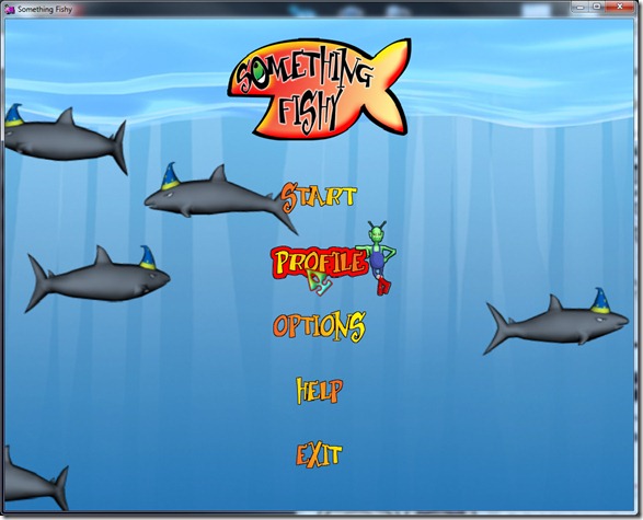
MainScreen_2011

The game won’t work on smartphones, but it’s a good match for tablets… Currently, I’m just trying to get the old code compiled with the latest version of Spellbook, but even that’s been proving hard, specially because of the font, since I changed it a year and a half ago (so that includes the concept of character metrics). Problem is that the hand-worked fonts of Something Fishy were done with the old system and while they worked well with that, they miss information necessary to work nicely with current Spellbook…

Need to fix that, either by generating the missing information, reverting that component to an old state (if I can find an old version of Spellbook pre-change), or *shiver* adding by hand the information…

Finally, also been thinking a lot on the new Image Bank system for Spellbook… I need a way to make it “multi-layer”, so I can have normal maps with the images aswell (some nifty 2d effects and for use with decals)… To do so, I want to add an Image Bank editor/generator into SurgeEd, but I need to think if an Image Bank is a component or a resource (probably both)… I already have a Font Generator in the SurgeEd, but I don’t like the way that turned out, so I‘m thinking to handle any resource editing as a separate component of the editor, with its own specific subsystems, but I haven’t made up my mind yet…

So stay tuned for more developments!


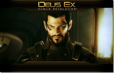
Deus Ex: Human Revolution

26 Sep

vg79715_deus_ex_wall_adam1

I’m a big fan of the first Deus Ex… it was one of the first games to feature “emergent behavior” as part of the design. You had the feeling that all the problems had different solutions, and you could tackle them in a variety of ways, much like pen-and-paper role playing games.

Then I watched “Deus Ex: Invisible War” turn a beloved game into a mockery of his former self, with huge amounts of bugs, silly AI, and a dumbing down of the overall concept (to appeal to more people, I guess).

So I was kind of divided about “Human Revolution”… on one hand, I hoped they would go with the legacy of the first one, on the other hand, I was fearful they would turn it into a cover based shooter like so many others…

Thankfully, they went with the better choice: Human Revolution follows in the footsteps of the first one, which is great news for everyone that loved it!

The game has plenty of faults (which I don’t remember the first having, but that might be the age-goggles speaking):

  • Although this game is a prequel to the first Deus Ex, the game feels more modern that the first one, not just because of the graphics, but because of the general tech level of things… The augments seem more primitive than the first Deus Ex, but the overall environment seems more futuristic
  • Loading times are huge (on the XBox, at least)… that might be mitigated by installing the game in the HD, but since I have one of those old XBoxes, I don’t have the HD for it and I’m not buying a new one anytime soon… This is very noticeable since you tend to reload a previous savegame to try to get through an area without being detected, which implies some trial-and-error…
  • The voice of Adam Jensen is terrible… well, overall the voice acting is terrible… all characters seem to be stuck in just one emotion (whatever that one is) and it doesn’t match up to the graphics – for example, there was one woman crying and very disturbed by something, but her model was smiling! It didn’t seem the least bit distraught, and that kind of spoils the emotional bond… In the case of the main character, he seems to be pissed off at something, even when he’s trying to be empathic or nice to someone… It reminds me of someone that took lessons in the “Christian Bale School for Actors”… It was trying too much to be dark and gritty.
  • The game world is too empty… You have great cities, loads of space for wandering, even a kind of sandbox groove to it, but nothing happens there… there’s just some side-quests (that are extremely linked to the game plot anyway)… I’d like to see more stuff happening; sometimes I’d wander around town and think to myself: “I wish there was some “clear the gang activity” quest here.”. I understand that the main character is probably too important for that (it would be kind of silly to have someone as important running errands), but if that’s a problem, maybe they should have built the game the other way around: start with an insignificant character that grows in importance.
  • The main character was too dumb… There’s nothing worse than you having connected the dots for ages now and the main character still acts completely oblivious to the situation… Five or six hours into the game, you’d already have a good idea on who the bad guy was, but Adam would happily run errands for him anyway…
  • Story was too convoluted… I know the idea is to build a good “conspiracy theory”, but it reaches a point where you can think of at least 10 different ways the “bad guys” could win without getting so complicated at it… Most of the game just seems like a prelude to the inevitable (and totally predictable) backstabbing…
  • Worse of the worse: the boss fights were stupid… This is a game mainly aimed at stealth (at least for me), but the only way to defeat the bosses was by shooting… no smart thinking, no stealth, not intelligent use of the environment… Nope, plain old “shoot-the-bastard-until-he-dies”… This is particularly nasty if you (like me) haven’t invested in combat skills, preferring to spend your upgrades in hacking and stealth. This is a stupid design decision; it breaks the entire core of the game and just frustrates the player – it’s not a challenge if the game is actually cheating by design!


But… even with all these faults, it is a great game… It took me about 16-18 hours to finish (which is good value for money in this day and age of 8 hour games), without me ever thinking “Will this never end?!”… Good area design, with plenty of options and choices to go around, depending on how you like to play (could have some more stuff for the hacker-ish)

If I notice all those problems in the game is because I feel the game could have been much more, but what it is is enough… Hopefully this will not be the end of the saga, and I wish in the future someone does a kind of cross between Deus Ex and the sandboxing of GTA (that would be totally sweet!).

Special mention to the music of the game… although it’s a complete rip-off of Blade Runner’s OST, it’s very good at establishing the mood…

After playing this one, I just feel like making a cyberpunk game and listen to some Billy Idol’s “Cyberpunk” album, while reading some William Gibson… Smile

Overall, it’s a 9/10 game, for those that like scores! Smile

 
No Comments

Posted in Games


LUA syntax

23 Sep

I love Lua for scripting… It’s easy to integrate with any C/C++ framework, powerful, fast, takes little memory, good debugging hooks, memory control, and (best of it all) it has coroutines, which is something that I utterly love in game development.

lua

But this is not an article praising Lua… To the contrary, it’s a rant about the stuff that annoys me in it and that I wish someone would fix… I know most of this could be fixed by me, since Lua is Open Source, but to be honest most of it would be a huge endeavor in the guts of Lua itself.

  1. Why 1-based arrays? Every language I know of has 0-based arrays (that is, arrays that start at position 0), but Lua had to be different… This is not a big problem per se, but the amount of times you do it wrong because you’re shifting from C/C++ to Lua is huge… Probably someone that sticks to Lua can do it without messing up a single time, but I’m an indy programmer!
  2. Why THEN and END? This is my main annoyance with Lua… All IFs in Lua have to have the keyword THEN after the condition, and END up when the syntax block ends… I understand being mandatory an instruction block (i.e. not allowing for a single instruction), since that leads to some ambiguities and tricky to spot bugs sometimes, but couldn’t they have used ‘{‘ and ‘}’, or even ‘[‘ and ‘]’, or something else but a clunky keyword that makes your code seem ugly? On the same note, the FOR and WHILE loops also require the DO keyword, which also sucks… is it that complicated to make a parser that doesn’t need those things?
  3. Use of doubles for numbers. This one I understand… numbers in Lua are expressed as doubles (which allows them to be fractional and yet provide a good range of integer numbers without loss of precision). But when you’re making games, you don’t want to keep switching between single and double precision on the FPU, and Lua kind of forces it (since you’re probably using floats all the time for everything else, like meshes). Adding an integer type and going for floating point numbers would help tremendously here (although I believe it wouldn’t be such a simple task as I’m stating, since the typeless nature of Lua makes it complicated, but I wouldn’t mind having some methods to work with floating point numbers, and others for integers for this purpose). The way I have it now, I do a compilation of Lua with numbers as floats for my game projects, and cross my fingers so that the precision doesn’t byte me in the future.
    What I do is when I want to treat a number as an integer (in comparisons and things like that), I round to the nearest integer… Hopefully that’s enough to stop some problems (which might be tricky to debug, since 3.9999999 != 4)
  4. Lack of types. This one isn’t really Lua’s fault (since most languages don’t do this), I would just really really really appreciate if I could have 2, 3 and 4 dimension vectors treated as internal types, so that I could use vector math in Lua (without the performance hit I get when I use arrays as vectors)
  5. Lack of pre-processor. Again, not Lua’s fault, but it would be nice to have a preprocessor in Lua’s parser… I can run stuff through the C preprocessor and feed that result to Lua, but that screws up debugging a bit, which is too bad…
  6. Lack of a class based system. I know I can use meta-methods and tables to mimic a class in Lua, but that’s not the same. Imagine that I return an object from C code. That implies that I “copy” the data from the C++ object to a Lua table, and push also some functions (C/C++ and Lua). This sounds terribly inefficient. It would be better to be able to specify some classes (with the methods associated to them), and just copy the data on top of the table. You might be able to do this with some trickery, but I haven’t found the trick yet, I admit. This one isn’t very serious, since Lua never pretended to be an OO language, and I can live just fine with passing some light user data values back and forth between Lua and C/C++.


I’ve looked into several other scripting languages (mainly Javascript (through the V8 engine) and Python), and they have more serious handicaps for my taste than Lua, and that’s why I keep using Lua.

Some of these seem pretty easy to fix for the developers (or someone that really takes the time to delve into the Lua source-code). Of course, changing these, will it still be Lua? I like to think that it would some sort of Lua+, different yet better. Maybe one of these days I’ll take the time to fix 1, 2 and 4 (well, 1 and 2, 4 might be too hard). If anybody knows someone that’s actually done some of this, feel free to give me a poke! Smile


The emptiness of space….

21 Sep

Everybody that knows me know that from time to time I get this urge of making a space opera game… The actual form of that space opera varies, from “Star Control 3 type”, to “Geometry Wars in real space”, to strategy combat, to more action-oriented, sometimes going on planets, other times in outer space only… All of them feature wandering about space, giving it a sandbox feel.

I usually spend some time day-dreaming about it, designing it in my head, etc… then some other more feasible project comes along and I forget it.

But one thing I always tend to get stuck in my head is a big problem: space is empty… Real space is boring,

Read the rest of this entry »

 
2 Comments

Posted in Games


Talk like a pirate…

19 Sep

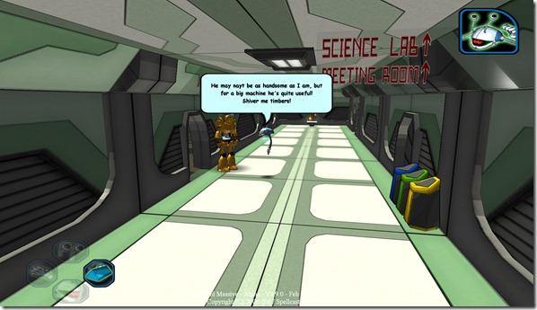
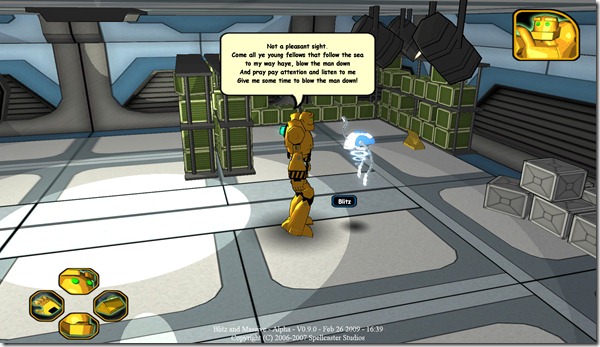
Today it’s “Talk like a pirate day”, and a friend of mine reminded me of an Easter Egg we added to the unreleased game “Blitz and Massive”…

The game, on every 19th September would activate the “Pirate Talk” mode, which would add some phrases to the dialogues, and change some other words to match pirate talk:

Screen00001

Screen00002

One of the many Easter eggs we’ve built into the game… Open-mouthed smile

Shiver my timbers!

 
No Comments

Posted in Games


Win32 Tree Component

16 Sep

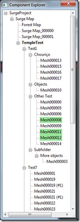
For SurgeED, I’ve had to build some tree views:

tree_view

I’m using the Win32 C API to build the GUI, but the TreeView control available didn’t support everything I needed (or supported it in such oblique ways it was too much work). I tried finding a control like this on the Internet, but either they cost money (which I can’t afford), the functionality wasn’t there, or they used MFCs (which I don’t like).

I decided to build my own, on top of the Windows one, and make the code available.

My tree view supports:

  • Multiple selection
  • Drag/drop operation
  • Context sensitive pop-up menu
  • Callbacks for
    • Selection
    • Command (WM_COMMAND message)
    • Drag operation (start/finish)
    • Popup called
    • Sort operation
    • Size change


You can download the files here. They probably don’t work “out of the box”, some helper functions are missing, and probably some includes need to be removed. Anyway, it should be easy enough to extrapolate what’s missing.

Some usage instructions (check .h file for the public interface):

  • To initialize (register the window class – you have to create a define called SURGE_TREE_VIEW with the name you want the class to have internally), you have to call “scc_register_tree_view()”. To unregister, call “scc_unregister_tree_view()
  • To create a tree view, either use a custom control (with the class set to whatever the name was), or something like:


HWND tree= CreateWindow(SURGE_TREE_VIEW,window_name,window_flags,
                        x,y,width,height,parent_window,NULL,instance,0L);

  • To enable/disable multiple selection, call “scc_set_tree_view_multiselect(tree,true/false)
  • To set a callback function, use “scc_set_tree_view_*_callback
  • To add nodes, you have to use "scc_add_node”. This takes as a parameter an object of type SurgeTreeNode (more on this later). This will add the node at the top level of the Tree View. To add elements as sub-nodes, use the “add_node” function on the SurgeTreeNode you want to be parent of this one.
  • The SurgeTreeNode is the base class of all the nodes in the tree. You should subclass it for “type of nodes”. For example, on the Component Explorer of SurgeED, I have loads of classes (“Project”, “Component Group”, “Component”, “Group” and “Entity”). All of these can have different options on the pop-up menu, have different behaviors on drag, etc.
    • add_node: Adds a subnode to this node
    • remove: Remove a subnode from this node
    • expand: Expands/contracts this node
    • toggle_expand: Expands the node if it is contracted, and vice-versa
    • select: Selects this node (and the nodes below, if the second parameter is set to “true”). Note that for this to work correctly, when you select a node, all the nodes below it are unselected (or else we could have some weird behaviors on the drags), although they are still highlighted (like they are selected because someone up the chain is selected)
    • toggle_select: Selects this node if it is unselected, and vice-versa
    • update_label: Forces a refresh on the label of the node
    • set_bold: Sets the label on this node to bold
    • (Virtual) get_label: Returns the label of the node
    • (Virtual) evt_select_change: This function is called whenever this node is selected
    • (Virtual) is_draggable: Should return true if this node can be dragged. Only if all nodes in the current selection can be dragged can the operation be executed.
    • (Virtual) try_drag: Should return true if this node can be dragged to the given target node
    • (Virtual) can_accept: Should return true if this node can accept all the given nodes as sub-nodes
    • (Virtual) notify_drag: This function gets call for each node that is dragged onto the target node, when the drag operation is completed (don’t have to do anything to change the structure of the tree itself, the nodes will be moved to the correct place)
    • (Virtual) get_menu_options: fetches a list of strings with the names of the options to show up on the pop-up menu. Only the options that are shared by all the selected nodes show up.
    • (Virtual) handle_menu_option: Gets called for all selected nodes when an option is selected.


For the record, you can use this code in any way you want (commercial and non-commercial), a heads-up and thank you would be nice.

I’m not responsible for any damages and bugs! Smile

Anyway, if you have any questions, just shoot them here or email me…

Hope this is helpful!