RSS
 

Archive for October, 2011

SurgeED–Image Bank Editor

28 Oct

After a couple of weeks, I’ve finished the Image Bank editor on the SurgeED tool… Took a bit longer than I was expecting, mainly because I had to add to the editor system the concept of child entities, with all the copy/delete/undo/redo/explorer issues associated with it…

But first of all, what’s an image bank (IB) and why do I use them?

Well, one of the main things you can do to increase performance in any engine (be it 2d or 3d) is to reduce the number of primitive drawing calls… I’m not talking about actual primitives, but calls to the function that draws them… That requires a call to the low level system, and that call has a fixed setup time, no matter how many primitives you render in that call…

So, it’s better to create a single buffer with 1000 primitives (sprites in case of 2d) and draw that, than have 1000 buffers and draw them all… The performance increase is in several orders of magnitude…

This process is called “batching”…

But to draw 1000 primitives in a single draw call, they have to share every render state (which includes all the like render properties, more importantly, the textures).

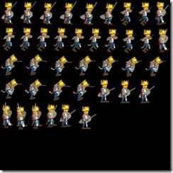
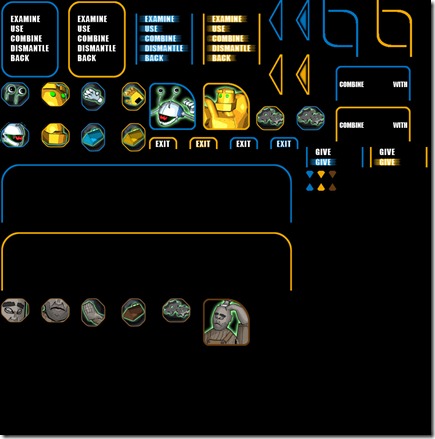
So, to draw 1000 primitives, they have to share the same texture, and this is done through creating an atlas, which is a single texture that has loads of images in it. Then, using UV mapping, we can index the separate images and use them in a single draw call to draw different objects… Below you can see an example of this:

BM_gui

This is accompanied by a file that describes where each of the individual images is:

<image_bank name="bm_gui_ib" delete_textures="false" normalized_coords="false" read_textures="true">
    <source>
        <layer type="diffuse">bm_gui</layer>
        <images>
            <image name="b_inv_arrow_s" x="703" y="0" sx="32" sy="95" hx="0" hy="0"/>
            <image name="b_inv_arrow_u" x="639" y="0" sx="32" sy="95" hx="0" hy="0"/>
            <image name="b_inv_btn" x="191" y="288" sx="61" sy="71" hx="0" hy="0"/>
            <image name="b_inv_combine" x="795" y="152" sx="184" sy="85" hx="0" hy="0"/>
            <image name="b_inv_exit_s" x="639" y="320" sx="73" sy="31" hx="0" hy="0"/>
            <image name="b_inv_exit_u" x="543" y="320" sx="73" sy="31" hx="0" hy="0"/>
            <image name="b_inv_menu_s02" x="319" y="32" sx="142" sy="25" hx="0" hy="0"/>
            <image name="b_inv_menu_s03" x="319" y="57" sx="142" sy="23" hx="0" hy="0"/>
            <image name="b_inv_menu_s04" x="319" y="80" sx="142" sy="24" hx="0" hy="0"/>
            <image name="b_inv_menu_s05" x="319" y="104" sx="142" sy="24" hx="0" hy="0"/>
            <image name="b_inv_menu_s06" x="319" y="128" sx="142" sy="24" hx="0" hy="0"/>
            <image name="b_inv_menu_u01" x="0" y="0" sx="142" sy="32" hx="0" hy="0"/>
            <image name="b_inv_menu_u02" x="0" y="32" sx="142" sy="25" hx="0" hy="0"/>
            <image name="b_inv_menu_u03" x="0" y="57" sx="142" sy="23" hx="0" hy="0"/>
            <image name="b_inv_menu_u04" x="0" y="80" sx="142" sy="24" hx="0" hy="0"/>
            <image name="b_inv_menu_u05" x="0" y="104" sx="142" sy="24" hx="0" hy="0"/>
            <image name="b_inv_menu_u06" x="0" y="128" sx="142" sy="24" hx="0" hy="0"/>
            <image name="b_inv_menu_u07" x="0" y="152" sx="142" sy="33" hx="0" hy="0"/>
……………

The hotspot describes where is the “grip point” of the image, which is helpful for rotations and just general positioning.

An image bank then gives “names” to the images and says to the system where it can go get them (in terms of texture and positioning). A single image bank can use several textures:

afonso0400afonso0401

This helps with the organization of the image banks…

One thing I added in the process of adding an editor for this (more on this later) was the ability of a single image have different layers (like diffuse, normal, etc). This will be helpful to define a decal system later, since I need both textures to create a really good decal, and I didn’t want to create separate systems…

Basically an image can have multiple layers, the only restriction being that all the layers have to have the same size.

Up until now, the artists would create these Image Banks by hand, positioning images in a big image and creating a text file by hand, specifying where each element was. This was time consuming and very error-prone, and this was one of the motivations for the image bank editor.

The way the image bank editor works is very straightforward… You create an image bank component, and add pages to it… Each page can have different sizes and support different layers. Then you import images to a specific page (with all layers being a different source DDS image). Then you can move the images around, using the normal tools of the trade (snaps to grid, to other objects, padding support with visual warning where two images are overlapping, etc)…

When the artist is satisfied with the image bank, he can “Generate” it and the system will create the atlas and XML file, and it becomes available to all the editor system. The component can then be deleted (it can always be created again from the image bank), or left alone.

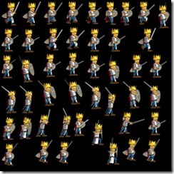
You can also add mountpoints on the images. On the sample above, you can see the character has a sword on his hand, but if we had a character that could yield a sword or an axe (for example), we could add a mountpoint to his hand and in the game run time, attach another object to a specific mountpoint.

I’m very proud of the editor as a whole, and this component is very cool in action, since I believe it will cut down development time for 2d games a big deal (artists could lose up to 3 or 4 hours creating an atlas by hand, and add 2 more hours or so due to small errors, like a wrong position (easy to spot) or a wrong hotspot (harder to spot)).


You can see the editor in action above… the frame rate is crap, think it is because of the on-the-fly encoding… This component doesn’t perform as well as I’d want, but it’s easy to understand, considering that each image has to be drawn separately (in its own draw call), because we’re trying to create the image bank that will solve that problem in game…

Next stop in my travels in game development land will take me to rebuilding the fonts for Something Fishy, so I can start trying to port the game to tablets.
 

Games of my life – Part IV

27 Oct

The year was 1987 and I finally got my own ZX Spectrum… I didn’t have money for games (not even copied games, let alone legal copies, which you never saw in Portugal), so I quickly learned how to program and did my first game (a text adventure), two weeks after I got it.

Anyway, that didn’t stop me from raiding friend’s houses and getting some games:

R-Type

R-Type was a shoot-em-up, a horizontal scrolling game in which you destroyed wave after wave of enemies and got powerups for your weapons… Great fun, and on the ZX-Spectrum, the game was so massive you had to load the game in pieces (which implied restarting play after you passed a level). It was released in 1987 for the arcades, developed by a company called Irem.


One of the powerups was particularly memorable: a beam that would fire in 45 degrees angles in relation to your ship and bounce off the scenario… When you got this one, you definitely had an edge…

This was probably the first game I’ve ever finished on my ZX Spectrum, and it took me loads of hours…

Sid Meier’s Pirates

Although this is a 1987 game, I only got my Amiga in 1990, and this was one of the first games I played…

Pirates is a game by Sid Meier (of Civilization fame) and developed by Microprose… It was also one of the first games to have the name of the main designer in the title.

In this game, you play as a pirate in the Spanish Main and you had to look for treasures, steal ships, rob cities, get status and reputation with some crowns, etc… It was a sandbox game, way before these became popular… You could build entire stories in your mind with the game serving as a framework…


The game was kind of hard for the time (I was a bit young still), since you had so much you could do at any moment… from going into taverns in friendly cities and finding that the Spanish Silver Convoy was going to pass some place at some time, and then go there to attack them and plunder, to getting status with the French Crown to get some lands and titles, the game didn’t have an “ending” by itself… you were free to chose whatever you wanted…

Never did get the hang of the ground city assaults, though… Disappointed smile

This game really had an effect on what I wanted to do as a game developer in the future years (although I never acted in that direction, to be honest)… I’d already played sandbox games like Elite before, but Pirates gave you a feeling of belonging to a living place, and did that with gentle nudges into “story-like” elements that really appealed to me, much more than the just open and vast world of Elite.

That’s it for today, I know it has been a short entry, but tomorrow I’ll have another post up, about the Image Bank editing tool I’ve finished on SurgeEd (maybe complete with video!)…

 
No Comments

Posted in Games


Blizzcon

25 Oct

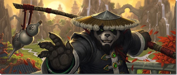
world-of-warcraft-mists-of-pandaria-artwork

Well, another Blizzcon has gone by and some news came from one of my favorite game developers…

No release date for Diablo III, but it seems the release is close, so crossing my fingers the game is as good as it looks (and to be honest, to see if it has aged well… It’s been almost 10 years since I’ve played Diablo, and I’ve played WoW in the meantime, that takes a lot of the Diablo ideas ten steps forward, so let’s see how it feels nowadays…)

No release date aswell for “Starcraft II: Heart of the Swarm”, and I can’t wait to play it… think it’s the most excited I’ve been for the release of an RTS ever! The DOTA thing they’re going to release doesn’t excite me that much, but I’ve never been a big fan of DOTA-type games, to be honest. It seems they’re trying to do something special with the genre, though…

And the big news… “Mists of Pandaria”, the new expansion for WoW has been announced (also without a release date)… This was expected, and to be honest I’m more or less disappointed with it.

  • New race: the Pandarens… Really? Pandas? Kung-Fu Pandas? That was the best they could come up with? What’s next? The Shrek Race?! Besides, for a 7-year player, adding a new race really doesn’t add anything to the game at this point…
  • New class: Monk… Again, same rationale as above… introducing another class for a 7-year old player is useless… I won’t stop playing my character to play a new one; I know there are some players that actually do it, but I wonder what percentage of players that actually is, and how significant it is for Blizzard… It seems to me that alt-oholics aren’t as committed to the game as hardcore raiders, and those won’t change characters that easily… On the other hand, that might be precisely what Blizzard has in mind: add new content for less-committed players because committed players won’t drop the game that easily.
  • 5 new levels. Same as Cataclysm, probably last a bit longer (because of the additional time it takes to level up). So its good enough, I think.
  • Pet battle system: Seriously? World of Pokemon? Was this something people actually wanted?!
  • New continent: This was expected, and the setting seems great. Oriental-based stuff is new in WoW, so it seems like a very good choice (allows for new visuals, new music, new lore)
  • Challenge Mode Dungeons: The concept seems interesting, but I think again it lacks interest for end-game players… But it’s probably good for more casual players (because of the gear normalization, a raider won’t get an edge, so it’s really just a skill contest, albeit raiders and pvpers tend to be better players because of the general playtime)~
  • New talent system. On Cataclysm, Blizzard changed the whole talent system, which required players to relearn their classes… now they’re changing it again, replacing the tree-system for a “choose your main orientation” – in the case of mages, fire, arcane or frost – with some new spells/buffs every 15 levels… Their idea was to diminish the amount of cookie-cutter specs around, and make player specs be more diversified and play-styles more different… but it seems to me (unless I’m missing something) that this will lead to basically people choosing their main spec and then some cosmetic choices (a bit like minor glyphs) that don’t actually change the gameplay style (at least by looking to the current proposition). I think they’re trying to limit something that can’t be limited: the endless search for the perfect spec, the best combination of stats/spec/glyphs that make the player perform best… They’re trying to limit this so that all players play differently, but I think their fighting a losing battle… If they want that kind of behaviors from the players, they’ll have to invest in better AI for the bosses and such, and make players have to improvise more…
  • Account-achievements: this is a good idea for people that have alts…


Now for my main complaint: no epic-ness!

There’s no "”big menace” (the whole “focus on the war between the Alliance and Horde” seems like a cop-out, since I couldn’t care in the littlest – most of that war seems to be driven by petty interests and 1000 year old history… Maybe players in PvP realms feel it, but most players in PvE realms couldn’t care less). The game has some new lore coming in because of the damn pandas (they were enslaved by some guys, so there’s some bosses there), but no epic threat… Come on, we’ve fought Elemental Lords, Elder Gods (and other demi-Gods), a Lich King, armies of undead, several bad-ass dragons (including one that ripped apart the damn world!), and now we’re kicking the ass of some guys that enslaved pandas?! Seems like anti-climatic…

Of course, this might all be a part of Blizzard’s plan to do a weak-ass expansion while “Star Wars: the Old Republic”, “Diablo III” and “Starcraft II” roll out, so they don’t “waste” good content, but it seems like a dangerous game… I’m almost considering quitting the game, and I’ve spent almost 7 years of my life playing it!

There’s more information coming out in the next months, so I might change my mind about a lot of things, but I can’t stop looking at this as the decline of World of Warcraft… still, it was 7 years, it was a very good run! Smile

 
No Comments

Posted in Games


4X+RPG

21 Oct

I’ve been feeling the urge for playing a good 4X (eXplore, eXpand, eXploit, eXterminate) game for some time now, in the same vein as the old Master of Orion, Deuteros or Sins of a Solar Empire, but I haven’t found nothing that tickles my fancy…

Tried out “10 Min Space Strategy”, and although it was good, the AI made the experience a bit annoying (not hard, just annoying); it also lacked the depth of the aforementioned titles…

Although I’m still searching, I started thinking on the whole 4X genre and I had an idea that I haven’t seen implemented and I would appreciate: a mix of 4X and RPG…

First, for some definition: when I’m talking about RPG, I’m talking more precisely of the CRPG aspect of it, and more to the point, the stats and character building.

I’m aware that most 4X games have a certain RPGish characteristic to it… You evolve your civilization (character) through resources (experience). Some of them even have experience levels associated to your units, etc…

But the idea that came to me was more related to “character development trees”:

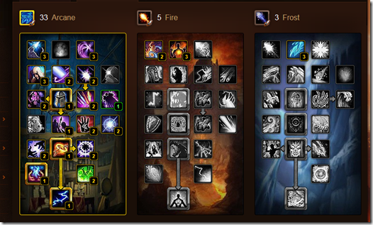
image

This is the World of Warcraft talent tree (for mages)… Every time you level up, you get a point that can spend on this tree. Although you select in the start of the game your class (and that effects what you can do, what roles you can take and how you achieve it), this affects the way you approach the game and changes a million things in the gameplay style (hence most high-level players spend an insane amount of time fine-tuning this).

There are 4X games that allow you to define “racial traits” when you start a game, but as far as I know, none of them allows you to have a dynamic/changeable tree that modifies the way you play the game while you play it, and I think that would be awesome…

I can think of several mechanics associated to this… Simple model, you get a point to apply in your “civilization tree” the first time you do some meaningful action (first planet explored, your first colony, your first defense against invaders, first death star, whatever). A bit more complex model would be to get some “civilizational experience” every time you perform a meaningful action (not only the first time). This would be a bit harder to adjust (for example, destroying a planet controlled by a weak opponent shouldn’t affect that civilizational experience that much). An even more complex model would be to have different trees and different experience levels (“Explore” tree, “Exploit” tree, “Expand” tree, “Exterminate” tree).

I think this would add an additional depth to the game, and an interesting one at that, specially if the designers would spend enough time thinking about the tree(s) and the elements within, considering all the four facets of the game…

Of course, this might be just a matter of semantics… there are plenty of 4X games that kind of do this through the tech-trees/research, but the fact you could change the civilization tree during the game, tweaking it to the particular needs (of course with some penalization, so you wouldn’t do that every 2 minutes) would lead to some interesting gameplay in my opinion…

Another thing I’d like to see in a 4X game (haven’t seen it yet as well) would be ground combats, although I admit that might add a layer of micromanagement that might not be suited to this sort of game… but it would rock to fight a battle in different layers (or more precisely, let the computer fight the battles, since I appreciate that more in my 4X… space combat strategy is a different beast in my opinion), having to decide before hand what kind of units my drop-ships would carry, and that could affect the amount of resources/facilities that could be salvaged from the planet (instead of just using an orbital bombardment to wipe it out).

Currently I have my hands full, with my spare time being occupied with “SurgeEditor”, “Something Fishy” port, and the “Cell.Ection” development for me to be able to tackle a new project, but I’d like to see this developed so I could play it, so get busy people!

 
2 Comments

Posted in Games


From Dust

19 Oct

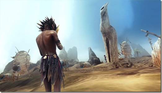
from-dust-screenshot

“From Dust” is a different game… it was created by Eric Chahi, the mind behind “Another World”, one of my favorite games of all times (and one of the most influencial aswell).

At the high-level, it’s a god-sim in which you control a worm-thing that enables you to modify the environment around you. In the beginning, you can pickup sand and drop in other places, but as the levels progress, you get access to more elements (sand, water, lava) and the interactions of those elements. You have to use those powers to lead a primitive nomadic tribe to the home of the Ancestors.

The thing that’s more evident in this game is the physics…. It’s amazing:

Everything reacts physically as you’d expect, but it’s just gorgeous seeing the water flowing down and then changing the course of the river with some lava or sand. The effect of a tsunami hitting your village when it is protected by a “water shield” is epic, to say the least!

And it all looks great… one thing that really impressed me (although it might be simple in implementation) was the skin rendering of the characters… the parameters/textures of the skin shaders were just right, it seemed to react to light exactly as I’d expect.

The game is not without his faults… the AI is sometimes appalling, specially the path-finding, but those small glitches can be forgiven (although they become frustrating sometimes).

The game has a slow pace, almost zen-like and (for me) the correct length (although many people on the Internet have complained of the short length of the game – for me, if the game was longer, I’d be bored). And after you finish the campaign you also have some challenges, and some of them are just plain diabolical (in a good sense!).

Overall, this game reminds me of Peter Molineaux’s “Populus”, but with modern technology and reduced to the point of almost minimalism, and I believe is a must in any god-sim fan’s collection. Just make sure you choose the console version (PS3 or XBox360) over the PC one, if you have a choice… it seems the PC version is weaker than the rest! 9/10.

 
No Comments

Posted in Games


Games of my life – Part III

12 Oct

Tadam! The return of what was supposed to be a regular feature on this blog…

Today, I’d like to delve into the Sierra games. This is not supposed to be a complete list of all Sierra games (not by a long shot!), but more of an overview of games that really influenced me.

Although Sierra has many more games, it’s mainly known for its graphical adventures. Founded in 1979 by Ken and Roberta Williams and was (arguably) the first game development company to mix the common and popular (at the time) text adventures with some “high-definition” graphics.

This post is about the graphical adventures, there will be other Sierra games I discuss in other posts…

Most of these games feature controlling a character around the screen and interacting with the world by text commands.

I played most of them on the Commodore Amiga (so I had better graphics), but some of the later ones I played on the PC.

I’m going to talk about the games in terms of series, and in chronological order (not the order I played them).

King’s Quest

kingsQuest

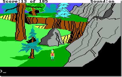
The “King’s Quest” series wasn’t the first Sierra game, but it was the first for the PC and is probably the most iconic of the lot, spanning 15 years of releases (1983 to 1998), with 8 games in the series (plus some spinoffs, a remake and the announced new episodic King’s Quest from Telltale Games).

The game followed the plights and tribulations of the royal family of Daventry and it was designed by Roberta Williams. The graphics now look extremely crude, but for the time they were amazing, specially compared to other adventure games.

This series has lots of mutation throughout its life, beyond improved graphics: first game with a female lead (King’s Quest IV: The Perils of Rosella), removing the text interface (King’s Quest V: Absence Makes the Heart Go Yonder), Disney like animation and singing (King’s Quest VII: The Princeless Bride), and full 3d (King’s Quest VIII: Mask of Eternity).

The games were good because of the use of lots of references from classic fantasy, like Little Red Riding Hood or Count Dracula. It made the world seem familiar, although its own identity was strong enough not to be overwhelmed and become stale because of that familiarity.

Space Quest

space_quest

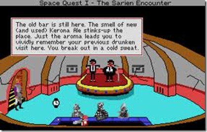
Created by Mark Crowe and Scott Murphy (alias known as “Two Guys from Andromeda”), the Space Quest series was my favorite one. Using the same game style as King’s Quest (in fact, most Sierra graphical adventures used the same engine, evolved from game to game), it featured the adventures of Roger Wilco, a perpetual loser. The game would parody lots of existing space franchises, like Star Wars or Star Trek.

The humor was the trademark of these adventures, and laugh I did… everytime I identified something from a known scify movie, I’d be terribly happy! Ah, simpler times…

The series started losing its charm when the Two Guys from Andromeda split up as a team (circa Space Quest V), but the four games they worked on together were pure magic (they were even characters in Space Quest III, which we rescue from the Pirates of Pestulon. We then proceed to bring them to Earth where Ken Williams hire them to make Space Quest!).

Leisure Suit Larry

leisure_suit_larry

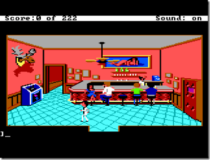
The raunchier of the group, this graphical adventure series created by Al Lowe is one the most well known of the Sierra catalogue.

It featured a character called Larry Laffer, a 40-year old man on his quest to get laid. The game seemed much more “sexual” in nature than it was in fact (and for today’s standards it is pretty mild).

Again, humor is the keyword here, the game making numerous references to 80’s iconic sex-symbols and seduction settings.

This was an extremely hard game for me to play as a kid (it wasn’t hard getting my hands on it, even though I wasn’t old enough to play it), because it required some knowledge about sex that I didn’t yet possess (although that didn’t stop me from finishing it and thinking: “what the hell?!”).

I’ve only followed this series until “Love for Sail”, but to be honest I felt it was terrible and gave up on the series.

Police Quest

Police%20Quest%20-%20In%20Pursuit%20of%20the%20Death%20Angel_1

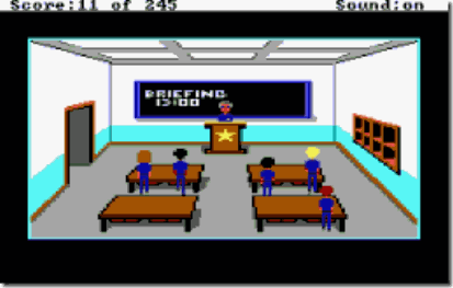
Police Quest is by far the most “serious” of all Sierra games… It was created by former policeman Jim Walls, which directed the series until Police Quest III. He left before the game was finished by reasons unknown, and the remaining games of the series (including the spinoff series “SWAT”) were taken over by former police Chief Daryl F. Gates.

I only followed this series until the 3rd one. The visuals on the 4th (photographed instead of drawn) put me off (at the time, even photographs looked terrible on a computer, so I was stuck in the uncanny valley).

The games had emphasis on following good police procedure (for example, you’d have to check the tires of the car before leaving the precinct or you’d have a flat tire and had to reload the game). The game featured driving around town in a top down map, police chases and police work collecting clues and such… For this, a map was provided to know the names of the streets and such, but I didn’t had access to original games at the time, so I had to learn them and create my own map: more fun! Smile

These games had a very good atmosphere, drawing you really into the police life and making you feel nervous about going into situations.

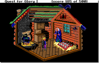
Quest for Glory

Quest%20for%20Glory%20I%20-%20So%20you%20want%20to%20be%20a%20Hero_8

Initially called “Hero’s Quest”, this was my second favorite series from Sierra… Created by Corey and Lori Ann Cole, it featured RPG elements and allowed a player to import a save game from a previous game (actually importing his character, with the skills and wealth you previously had).

Each of the five games in the series borrowed heavily from a specific mythos, from Slavic to African tradition, to everything in between.

The role playing element influenced the game very much, and separated it from the other fantasy series in the Sierra catalogue (“King’s Quest”). You could choose to be a warrior, magic-user or thief, and some puzzles had different solutions depending on this (and how high your skill levels were). This sometimes became a bit frustrating, since some puzzles would require you to do tedious tasks in order to level up a particular skill, but the feeling of epicness was huge!

The stories tied into a big arc, to be resolved on “Quest for Glory V: Dragon Fire”. Unfortunately, due to financial issues, the game was a bit rushed and it feels like an anti-climax…

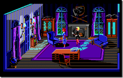
Laura Bow

Laura%20Bow%201%20-%20The%20Colonels%20Bequest_1

The two Laura Bow games, “The Colonel’s Bequest” and “The Dagger of Amon Ra” were more “under-the-radar” titles than the usual Sierra fare.

This was probably due to the key point in “The Colonel’s Bequest”: events took place in semi-realtime. This meant that revisiting locations was important, because the environment would change depending on the time (or other actions somewhere in the game).

The idea of “The Colonel’s Bequest” was to create a real “murder mystery”-type of game (like the first games Roberta Williams designed for the Apple II, like Mystery House), it was right on the nose on that. Finding the murderer was really rewarding, although it was extremely hard for the time.

The sequel, “The Dagger of Amon Ra” was much more straightforward and back to the origins, taking less risks in terms of game design. That can be explained by the fact that Roberta Williams wasn’t involved anymore. The story was much less ambitious as well, using more stereotypical settings and characters than usual in a Sierra game.

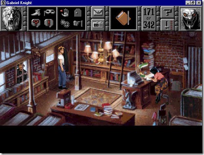
Gabriel Knight

gk2

Created by Jane Jensen, this series was a weird one for me… Although I loved the first one, I loathed the following, mostly because of the art approach (replacing hand drawn graphics by full motion video, with less than stellar interpretations).

The first game takes place in New Orleans and involves a mystery with voodoo contours. The games atmosphere was amazing (specially considering this is a 1993 release), and the writing is really good (a constant throughout the series, even with me not appreciating the sequels).


The Sierra graphical adventures might not have been the best games ever, but they are certainly some of the most influential… in a time where most game stories were “aliens are invading, shoot them!” or extremely boring text-based adventures, they opened a new door combining imagination and game, mixing them seamlessly to create an experience that I seldom felt so strongly about since. From the sheer scope of the games (from space operas to fantasy RPGs), to the risks taken in producing them (innovating just enough to keep ahead of the competition, but not so much as to lose that special something), Sierra has been successful in not only building great games, but in building a legacy…

Every time I create a story for a game, I can’t help but feel that I’m paying homage to the past where I spent so much of my time… For example, I can’t help but compare “Blitz and Massive” to “Space Quest”…

Sierra will always have a piece of my art due to these games and I was extremely sorry when they faded and disappeared (even if I didn’t think their last graphical adventures measured to the old ones)…

 
No Comments

Posted in Games


Dark Void

10 Oct

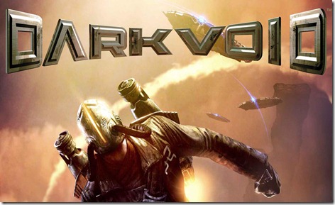
dark_void

Just finished playing “Dark Void”… When it came out, it wasn’t something I really needed to play, but I found it on the bargain bin and decided to give it a try…

Rant number one: DON’T PUT SPOILERS ABOUT THE STORY IN THE FLAVOUR TEXT ON THE LOADINGS!It’s just stupid and kind of ruins the game for people that actually enjoy being “surprised” by the story.

Anyway, having finished the game, I can’t help the feeling that the game was rushed, which is too bad. Given more time, the game could have actually been very good, instead of just average.

From a game mechanics standpoint, the game is the usual fare of 3rd person adventure games, but with some nifty things. It has a “vertical combat” mechanic that is actually fun and interesting, in which your characters is dangling on ledges and such and has to fight enemies. The other one is the main selling point of the game: the rocket-pack parts.

Most of it feels solid, although the level design borders on boring sometimes. For example, the hangar part reminds of the obnoxious “Library” level on Halo 1, being too long and the same from start to finish, without anything interesting happening (besides killing hordes of enemies, of course).

But where this game fails the most in the story-telling… they’ve created an interesting premise, with a lore-basis that might have been original, and then ruin it with basic storytelling (with basic storytelling mistakes)…

In the game, you play as a hot-shot pilot that has to ferry his once-lover to some place, for some reason (yep, it’s that detailed) and instead get sucked into the Bermuda Triangle that leads the player to another world… Not to spoil the game for anyone, stuff happens there… Smile

The basic plotline is paper thin, the cut-scenes are generic, converting what could be interesting characters into simplistic archetypes and hinting at a larger than life world outside, but never showing it, or letting it interfere with the game itself… Most of the game you spend your time going from place to place, doing things over a time span of supposed months, but nothing has actual bearing into your motivations… most of the time I didn’t know WHY I was doing things, although it was very clear WHAT I had to do.

And it’s a shame, really, because there are some visual details that are interesting (the Watcher’s “hair”, for example), but it gets lost into the usual “fight the minions of the real bad guys, which are actually robots because we don’t want to show blood”… and don’t get me started on the climatic finale, which the game has been gearing up since the start… it’s silly and inexplicable and introduces a plot hole the size of a small planet!

It feels like either the game was rushed, or without a solid direction from the narrative standpoint… the things it does badly (from generic characters with no charisma, to the use of the over-used Tesla as “science-guy”, the single black guy that speaks as if he’s just come from the middle of Africa, the pieces of “lore” that are dropped in the middle of the story, the list goes on forever) are basic ones that are covered in any narrative course!

And it’s too bad… the game disappoints because it has good concepts, we can see its potential and then it drops the ball almost continuously… 6/10

 
No Comments

Posted in Games


RIP Steve Jobs

07 Oct

20111005_stevejobs

As most people, I was kind of taken by surprise by the announcement of the demise of Steve Jobs…

We all knew of his disease, but still he felt in a certain way unbeatable, and as such, immortal…

I was never a big Apple fan, for several reasons, but without a question, Steve Jobs was an amazing visionary, a hell of a marketeer, and the face of one of the biggest computer revolutions of the last 10 years – the true mobile-related market wouldn’t exist without him.

He made mistakes, like so many other people that have a dream and try to make it a reality, but we will remember him by his successes more than his failures and it is with sadness that we see him go…

RIP Steve…

 
No Comments

Posted in General


Sub-entities

03 Oct

Some more work on my SurgeEd…

The next step on my editor is the decal system… Although Spellbook already supports decals, I want to make the system better for authoring and for resource management.

At the moment, a decal references a decal sheet, which is a structure that defines UV coordinates on multiple textures (for normal mapped decals, etc), but I want to collapse the decal sheet and the image bank into a single structure, since it’s easier to manage.

To do so, I’ve decided to build into the editor a “Image Bank Editor” component, which will enable me to place images in a series of layered “texture sheets”, and after some consideration, I’ve started building a system with support for sub-entities, that is, entities that can only be bound to a specific entity.

Easier said than done… I did some mistakes in the general construction of the base system which made this much harder, specially on the interaction of the Component Explorer (the tree-like view where you can see all the objects and select them, drag them around, etc) and the main component system.

The base system was pretty easy to get up and running, but creating the right hooks for the Component Explorer to work nicely with the overall structure, including the Undo and Clipboard systems proved a challenge…

Fortunately, I got it working, and the future expansion of the system will allow me to create very interesting things, like object properties that reference an entity in the scene.

Tomorrow I’m heading out to the Netherlands for some work (sadly, I have to have one of those to make a living), and hopefully that will enable me to make some blog posts for the future (so I don’t spend so much time “away” from you, my loyal readers!) Smile