RSS
 

Sound woes…

14 Sep

My artist has been ill these last couple of weeks, and as such I’ve done nothing on “Amoeba” lately… It’s hard staying motivated when working alone on a project (at least for me).

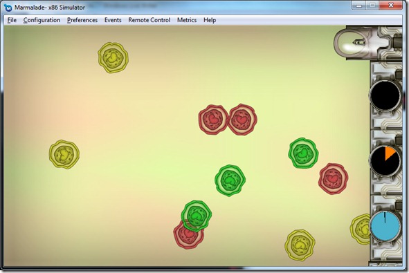
sample01

Anyway, since he’s back I decided I should try and get this game finished (still don’t know what I’ll do about the music and from the commercial perspective)…

The main thing on this project (for me at least) is getting experience on mobile platforms, and to release this on multiple platforms (first on iPhone, Android and PC, then Mac/Linux, and finally WM7), and that part of the plan has been working as intended – although only really experimenting on Android and PC).

As I’ve said before, I’m using Marmalade to be able to build the game using my existing engine, Spellbook. So far, it’s been a pretty decent experience, I’m using Spellbook to build the game itself, and I just have a very thin abstraction layer that wraps Marmalade, but has the same interface as my main deployment platform (DX9+FMOD+DirectInput).

But, alas, finally I’ve found problems, with the sound component. The sound API of Marmalade is very poor (understandable, since it’s not very important in the mobile market), and only supports 16-bit PCM RAW files. This requires you to know the sample rate of all the sounds when you play them out (instead of loading that information from the WAV header or something). Of course, this is not the focus of Marmalade, but since they wasted so much time on the graphics APIs, they could have been as complete in the sound API). They have support for compressed audio, but only for the streaming API.

This is particularly bad for someone like me, that’s been using FMod for ages, and I’m used to just loading samples with one call, and playing them with another…

Anyway, it’s relatively simple to do a WAV or some other uncompressed format loader, but for “Amoeba” I can skip that and use RAW files playing at 22Khz… I’ll have to change this for the PC version (which can use FMod), but for now it’s good enough.

The real problem I’m having is not related to Marmalade, but with the sound system of the Android handhelds… There’s a huge latency between the call to the sound player and the actual sound playing (in some cases, almost one second). Some searches online lead me to believe that this is a problem with Samsung mobiles, but it’s a serious flaw, since even 200 ms lag time in a game can make everything look much worse… I’ve even ran “Angry Birds” on my Samsung S, and although I didn’t notice it before (it’s subtle in the case of that game), there’s a delay present aswell, so I believe it is unavoidable… Going to try it on a Google Nexus phone in some days to see if the problem is exclusive to Samsung’s implementation of Android… if so, I’ll have to rethink sound in the game, since it can become annoying, doing things and getting the sound feedback 200-500 ms later…

On other notes, I’ve also did some memory profiling, trying to see if I have memory leaks or anything, but I found a problem that got me stumped… According to the ARM emulator, I have about 4 Mb allocated (plus another 4 Mb on OpenGL textures), but my task manager on the Android shows about 40 Mb allocated (more precisely, when I close the application, I get about 40 Mb back). I’m not sure if the Android stack pre-allocates some amount of memory, even if I don’t use it, and I maybe can adjust that on the manifest (saving that for later in the project); but I’m very sure that I don’t allocate 40 Mbs of data on my game!

But hey, no memory leaks! Smile


The hiatus

12 Sep

Hey all!

I’ve been neglecting (again) my blog… but I got good reasons! Smile

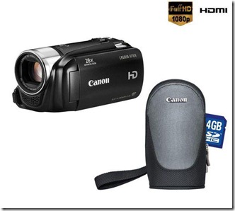
One was my birthday, which implies a lot of partying… My wife got me a neat video camera (I’ve been lusting for one for ages!), a Cannon Legria:

l_09822270

It has nice quality… maybe on my next Ludum Dare 48 hour compo I’ll manage to use some rotoscoping or live video to make the game sprites… Smile

Anyway, after that excuse runs out, I’ve been having too much fun playing around with my editor! I can only work on it on my spare time (when I also write this blog), so when I get into the zone I tend to not deviate from it.

From a practical standpoint, just added some options to the light system (soft shadows, through PCF) and moved the light creation to the a new “Instance entities” tab on the toolbar. It makes sense, since there’s nothing different on the creation of the light and the other entities. This way the GUI becomes more organized (and more akin to 3d Studio Max, aswell).

Most of the changes in the editor was the updating of resources. Now it is possible to reimport some assets and have them replace the existing ones, which is really cool!). Was thinking on live update (modify the resource files themselves and have the system update), but decided against it. The editor is built on the idea of being a self-contained “project”: it has its own directory structure, naming schemes, etc, so I don’t want the artists/level designers to be able to change things around… too much potential for disaster, in my opinion… I rather have them export the assets to some temporary directory somewhere on their hard drive, and explicitly import the assets into the project. It requires an extra step (or two, since the system asks the user if he really wants to update the assets), but I think its not a big deal. Anyway, if we see the benefit in this, I can add an option for a live-link, which are files that get imported automatically as soon as they’re modified (without asking anything, etc). Also want to add live update of textures (since that’s a different resource type, we can afford to break the coherency of the system for that, since they get copied to the project itself).

The editor is coming along nicely, its already considerably powerful and it works pretty well (still has the occasional crash, but since the system auto saves almost continuously, it doesn’t cost the artist anything). Next step on the development map on it is helper objects (with object linking/sub-objects and sub-classing working properly). I’ll make a video then (a better one than the last, with narration!).

Anyway, I’ll do an effort to be more regular at updating the blog… Smile


SurgeED

30 Aug

Worked a bit on my editor, fixed some bugs, improved some others…

Main improvement was a bug fix on the shadowmaps for point lights… everything that was behind the light (used the “back” shadowmap – using dual paraboloid shadows here) was being rendered wrong, depending on light orientation (that shouldn’t affect point lights).

Good shadows on point (and hemisphere) lights still depend a lot on the tessellation of the scene (due to the dual paraboloid projection)… I’ll probably add the option for cube-map based shadowmaps, they might be better (albeit way more expensive) for specific cases. The cost might be offset with better batching of solid geometry (create a bunch of vertex buffers with just positions, which is all is needed for shadowmaps), shadow-atlas (eliminate render target switches, but need more complex shader code and the “border” ability on the texel-sample – win the ability of batching shadow-mapped lights and less texture source set-operations) and slower updates on the shadowmaps (update only every 2nd frame or something like that).

The video quality is crap, and the mouse cursor isn’t visible… I was using SnagIt 8 to do the capture, with a DivX codec and 30 FPS capture, but the results were terrible… Hopefully I’ll figure out a better way to do these captures in the future…


GUI stuff…

29 Aug

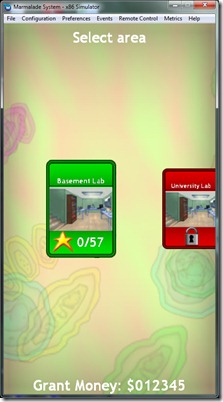
I’ve been working on and off on “Amoeba”, mainly focusing on the GUI work (area selection, level selection, etc), and it has been a struggle:

gui_work

First, the “simple” problems: font aliasing was hard to get rid of (and its not completely solved, but on my Android phone you can’t see any major artifacts, specially if you aren’t looking for them).

Then the complex problems: different screen resolutions/orientations. I want “Amoeba” to work on all devices I can possibly put it on, and that means different resolutions and orientations. We got 480×800, 1024×768, 640×960 and many more… And these means different aspect ratios, which just add more confusion to the problem.

The game itself is easy to adjust to the resolution (I have a virtual resolution system coupled with some “margins” disguised with some GUI elements), but if I do the same on the GUI, it looks amateurish, and that’s a definitely no-no on indy game development…

I could program a kind of interchangeable file with the positions of the elements (or use structures in C++, whatever), but even that is hard to tweak, because of dynamic scaling, and I have to consider ALL the possible resolutions. But this might be a solution in the future; I’ve already decided that all my next mobile games will only support one orientation anyway, since it’s too much work supporting multiple ones…

So, getting the GUI working on different resolutions/orientations/aspect ratios has been a though fight… and it’s only half the battle…

Then we have the code problem, where we hook behaviors… what happens when I left click and drag the mouse (equivalent to taping the screen and dragging my finger on it)? What’s the reaction…

On this project, I initially had all the code in C++ in the animation loop of the screen, but it was becoming unmanageable. Every change implied going through loads of conditions to get to the right place, and half the time I’d just get it wrong anyway… Confused smile I decided to scrap that and go for scripted GUI. While it’s not much better, it’s easier to control a GUI with LUA co-routines, specially transitions between “pages” of GUI. It’s still not optimal, but a bit better…

Working on this (and on my previous experiences with GUI elements), I got thinking… I hate GUI work, but mainly because it seems to be much less organic than the rest of my code (at least the end result). Why is that?

One reason I can think of is that “I HATE GUI WORK”, so I do sloppier code to try to get it over with… the other possible reason is lack of planning of the GUI and its elements. Finally, the lack of a really defined GUI framework on Spellbook might hinder me aswell…

Basically, I see 7 different ways of creating a GUI/GUI logic:

  1. All GUI elements on a particular game are a separate C++ object that can handle itself. This was the approach I used on “Blitz and Massive” and it worked very well, from a code organization point of view. This was further facilitated due to the fact that most of the “end result” of the GUI actions were script calls.
  2. We have a generalized object system (with sprites, text, aggregate objects, etc) and we instance it in C++. Control is done by using the animation pump that reacts to specific events. This results in long, hard-to-manage code, and loads of “temporary” variables to handle the state of the system.
  3. Same as last, but using scripting to instance the objects and registering events. Events trigger script calls that change the system. The “temporary” variables are more contained and can be handled locally by the scripting. Problem is that a language like Lua has great facilities for co-routines (superior to all languages I’ve ever seen!), but it’s terrible for flow control (because of syntax… seriously, on the 21st century, someone still requires the “THEN” keywork for an “IF” clause!?!?)
  4. Same as 2), but use a more sophisticated event system for the event handling, instead of the animation pump.
  5. Use a GUI middleware (from native stuff like Win32 or iOS stuff (not cross-platform), to more “game-like” alternatives like Scaleform (expensive) or “web-like” like Webkit/Awesomium (I hate web-technologies and don’t want to have 2 scripting languages involved in a single project)).
  6. Roll your own GUI middleware (a giant enterprise by itself!)
  7. Hire a gnome to do it!


I see pros and cons in all of these, but I think that most of my problems can be addressed with taking the time to think about the GUI, to plan it appropriately, like I do with the rest of the game components…In the meantime…. I REALLY HATE GUI WORK!


VVVVVVV

27 Aug

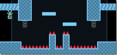
vvvvvv

VVVVVV is a game developed by Terry Cavanagh that has caused quite a buzz in the indie game scene… Unfortunately, I didn’t pick it up right away when the buzz started, since I was put off by the retro graphics (I like retro graphics, but those just look ugly!). Only when it hit the Humble Indy Bundle 3 I finally gave it a try, and boy, was I missing out!

At first glance, VVVVVV is a standard platform game with a gimmick: instead of the usual jump action, you can reverse the gravity of the screen, making your character shoot out in the air and walk on ceilings… Although this looks like pretty simple stuff, it really adds a differentiation factor to the game. That, coupled by an exploration component really makes the game shine.

The level design is brilliant, with very challenging areas… when you die, you just restart in that room, so frustration is kept to a minimum.

The story is as straightforward as possible: a ship gets thrown into a strange dimension (the VVVVVV dimension) and the crew gets split. The captain has to go rescue them… Throughout the game you get clues on what the dimension is all about. What the game does right is to make you empathize with the characters, even such so crudely drawn and distinguishable only by color, by using simple texts and making you work hard to get access to them…

The game ends when you rescue all 6 members of the crew (I did it in 2h30, dying “just” 1400 times, but I’m not very good at platformers).

VVVVVV does a minimum of hand-holding and it’s quite merciless in some rooms, but even rooms where I got stuck for 10 mins seemed to be “fair”, i.e. the challenge wasn’t overcome because the game was being too hard, but because you suck! Smile

Seriously, this game deserves all the praise I’ve been reading about it in the last months, specially considering how cheap it is! Even the graphics, which at first glance seem really ugly kind of it with the overall theme, and I ended up appreciating the simple color schemes and forms…

This game is a 10/10!

 
No Comments

Posted in Games


Guild Wars trailer

25 Aug


Although I’m not a big fan of “Guild Wars”, this trailer (at least the first part) is amazing… the music is absolutely brilliant, and the special transition effects just put me in the mood for some epic-ness… Brilliant work…

I’m wondering if you can do something similar to the transition effects in the first part of the trailer with realtime 3d graphics and some nice juicy shaders… You could go around it by creating a “stroke map”, by analyzing the direction of the surfaces you render and use that as a basis for a “paint stroke” effect that would fill the screen with the painted scene. To do the depth effects, you could “clamp” the Z of the objects to specific depths before transforming them to screen space, doing “layers” of an ortho-perspective… I’d love to have the time to experiment around with this…

 
No Comments

Posted in Games


Dropping out…

20 Aug

I’m dropping out of the compo…

I’ve been tired like a dog, and not feeling very motivated with this game (although I have an idea and progress has been good)… Some ideas just don’t click like they should when it’s time to develop them… Confused smile

Anyway, good luck everyone that is still participating!

On Monday it’s back to work for me, so expect more regular updates on the blog!

 
No Comments

Posted in Games


36h31m to go…

20 Aug

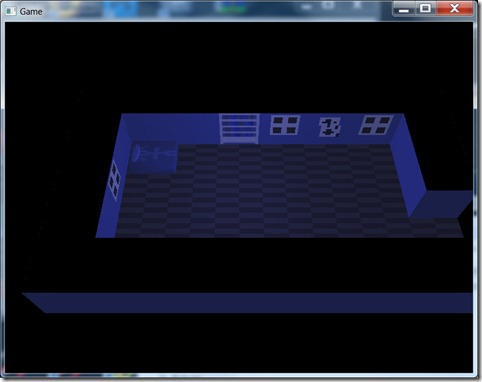
Finished most of the art for the starting area, the bedroom… It is supposed to be a night scene, hence the blue hue… I’ve screwed up on that already, since I want to make a light spark cast glow on the scene, and it will all show blue (should have done stuff in their “normal” color, and let the lighting engine take care of the blue-fication…). I may fix that before the end, but I’ve lost enough time on this, with 3d props, etc… specially considering this is just for a cutscene…

screen02

Next step is adding the scripting system to this, so that I can start coding the cutscene proper and get some gameplay in…

  • Load level
  • Get Lua scripting working
  • Draw main character
  • Character display
  • Character movement working
  • Draw area tiles
    • Bedroom
    • Corridor
    • Forest
  • Game mechanics:
    • Follow mechanic
    • Reversed keys
    • Perpetual movement
    • “Just jump” mechanic
    • Darkness
    • Random teleport
  • Cutscene system
  • Initial cutscene
  • Text render
 
No Comments

Posted in Games


38h08m to go…

20 Aug

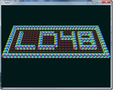
Got the level loading working (placeholder tiles) from an XML file:

screen01

Also designed the main character:

main_character

Imba pixel art skills… Smile

I still have no idea on what to do on the environment front, from an art standpoint… Don’t want to do the usual “dungeon” theme I do on this kind of thing, but my graphic skills don’t go much further than that…  but I have to try, since I wanted the game to start in the heroine’s bedroom…

  • Load level
  • Get Lua scripting working
  • Draw main character
  • Character display
  • Character movement working
  • Draw area tiles
    • Bedroom
    • Corridor
    • Forest
  • Game mechanics:
    • Follow mechanic
    • Reversed keys
    • Perpetual movement
    • “Just jump” mechanic
    • Darkness
    • Random teleport
  • Cutscene system
  • Initial cutscene
  • Text render
 
No Comments

Posted in Games


39h26m to go…

20 Aug

Got an idea for the game… You’re a girl trying to escape the nightmares in your mind… Each level has a different gameplay mechanic, like inverted keys, or having to follow something, and hopefully a surprise ending (which I still don’t know what it will be!).

Want to have time to work hard on the cutscenes, general ambience and level design, so I need to do good progress in the beginning.

Task list:

  • Load level
  • Get Lua scripting working
  • Draw main character
  • Character movement working
  • Draw area tiles
  • Game mechanics:
    • Follow mechanic
    • Reversed keys
    • Perpetual movement
    • “Just jump” mechanic
    • Darkness
    • Random teleport
  • Initial cutscene
 
No Comments

Posted in Games